Hello. Thank you to all customers who use SellerVisor.
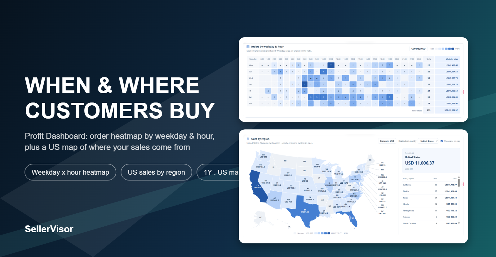
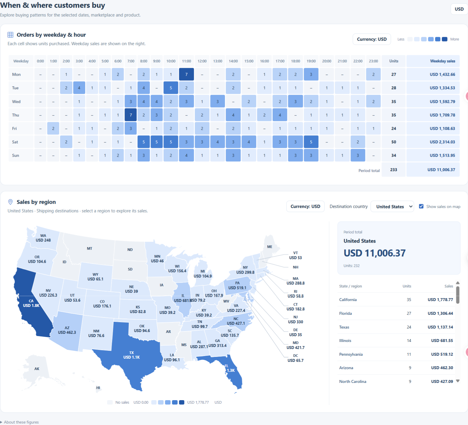
With this update, the "When & where customers buy" section has been added to the Profit Dashboard. These are two widgets that allow you to see at a glance, with a heatmap, which days and times orders are concentrated, and in which regions sales are high.
Where to find it
When you open the Profit Dashboard, you'll find the "When & where customers buy" section in the middle. If you select a period (7D · 30D · 90D · 1Y · Custom), marketplace, and product (All ASINs or specific ASIN) from the filters above, the two widgets will recalculate according to those conditions.
Setting the period to 7D or 30D shows recent trends better, while 1Y reveals seasonality more clearly. If you change the product filter to a specific ASIN, you can see the order patterns for that product only.
1. Orders by weekday & hour heatmap
The vertical axis represents Monday to Sunday, and the horizontal axis represents 0 o'clock to 23 o'clock. The number in each cell is the quantity sold during that day and time, and the darker the color, the higher the quantity. The two columns on the right show the total quantity (Units) per weekday and the sales (Weekday sales) for that weekday.
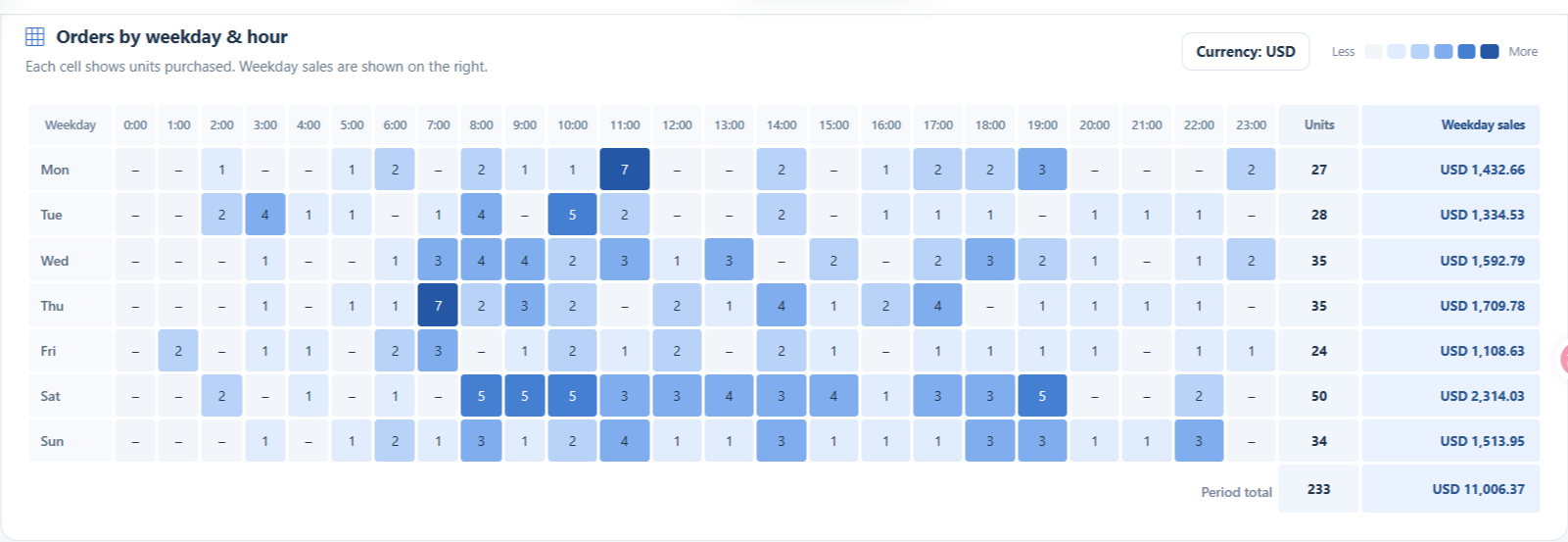
Looking at the example account's data for the past year, Saturday had the most with 50 units ($2,314.03), and Friday had the fewest with 24 units. In terms of time slots, 8 AM and 11 AM each had the most with 20 units, while 0 AM and 1 AM had almost none. This means that even for the same product, daily sales can nearly double depending on the day of the week.
2. Sales by region heatmap
Sales amounts by state are indicated by color on the US map. States with darker colors are regions with higher sales. Clicking on a state on the map allows you to view that region separately, and turning off the "Show sales on map" toggle allows you to see only the numbers without the map.
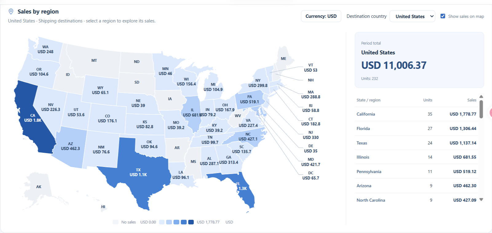
The list on the right shows the quantity and sales ranking by state. In the example account, the order was California (35 units · $1,778.77), Florida (27 units · $1,306.44), and Texas (24 units · $1,137.14), and states that remain gray are regions with no sales during that period. You can also check orders from other countries by changing the shipping country.
How can this data be used?
- Ad Budget Allocation: If there are clear days and times when orders are concentrated, you can increase exposure with the same budget by allocating more budget around those times and reducing it for quieter periods.
- Coupon and Deal Timing: By launching coupons or promotions just before peak days, you can leverage existing traffic.
- Inventory and Order Planning: For products with large daily fluctuations, this data provides a basis for advancing order placement to ensure inventory doesn't run out before peak days.
- Regional Targeting: You can adjust ad region settings to target top-performing regions, and review shipping times and costs for states with no sales.
- Product Comparison: By changing ASINs in the product filter, it becomes clear that each product has different strong days and regions.
Things to keep in mind
- Both widgets reflect the selected period, marketplace, and product conditions exactly. If you change the period, the entire heatmap will be recalculated.
- The numbers in the heatmap cells are based on quantity. Amounts can be checked in the weekday total column and the list next to the map.
- The regional widget is aggregated based on the shipping destination. Therefore, even for the same period, the weekday totals and regional totals might differ by one or two units.
- Cells with no sales are displayed as a blank (–), and states with no sales are marked as "No sales".
Frequently Asked Questions
Q. Should I turn off ads during low-order periods?
A. It's safer to reduce the budget allocation rather than turning them off. There are still converting orders during low periods, and performance can fluctuate if learning is interrupted.
A. It's safer to reduce the budget allocation rather than turning them off. There are still converting orders during low periods, and performance can fluctuate if learning is interrupted.
Q. Are regional figures based on shipping destinations or buyer residences?
A. The dashboard aggregates data based on shipping destinations. Differences may occur in cases where the actual buyer and shipping destination are different, such as gift purchases.
A. The dashboard aggregates data based on shipping destinations. Differences may occur in cases where the actual buyer and shipping destination are different, such as gift purchases.
Q. Can I see orders from other countries?
A. You can view the regional distribution for a specific country by changing the country in the regional widget's country selection.
A. You can view the regional distribution for a specific country by changing the country in the regional widget's country selection.
Conclusion
Knowing when and where orders come in allows you to set much more specific ad budgets and inventory plans. Check it out yourself by changing the period and product in the Profit Dashboard.
If you have any feedback or inconvenience regarding the feature, please let us know at [email protected]. Sincerely, The SellerVisor Team